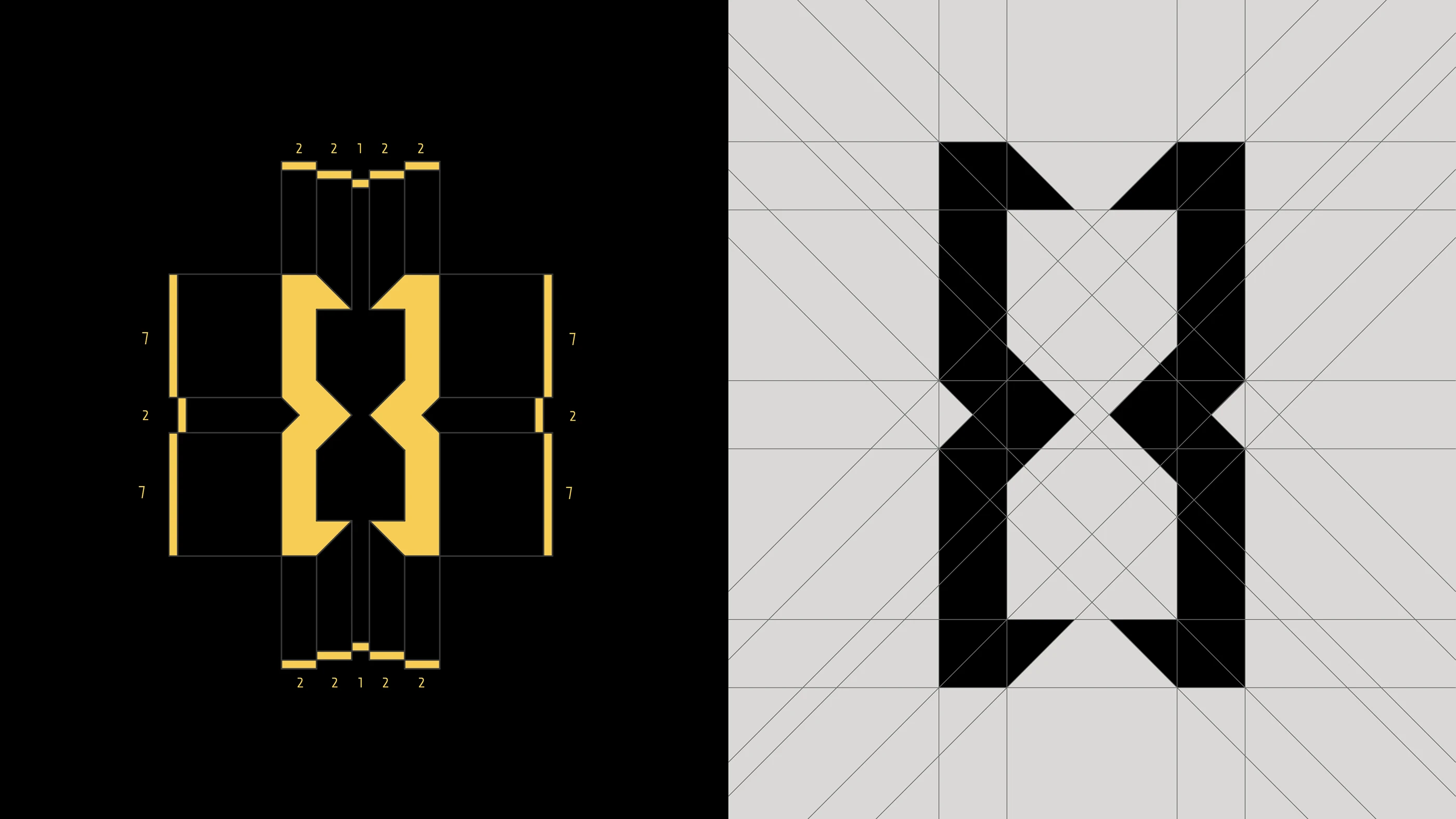
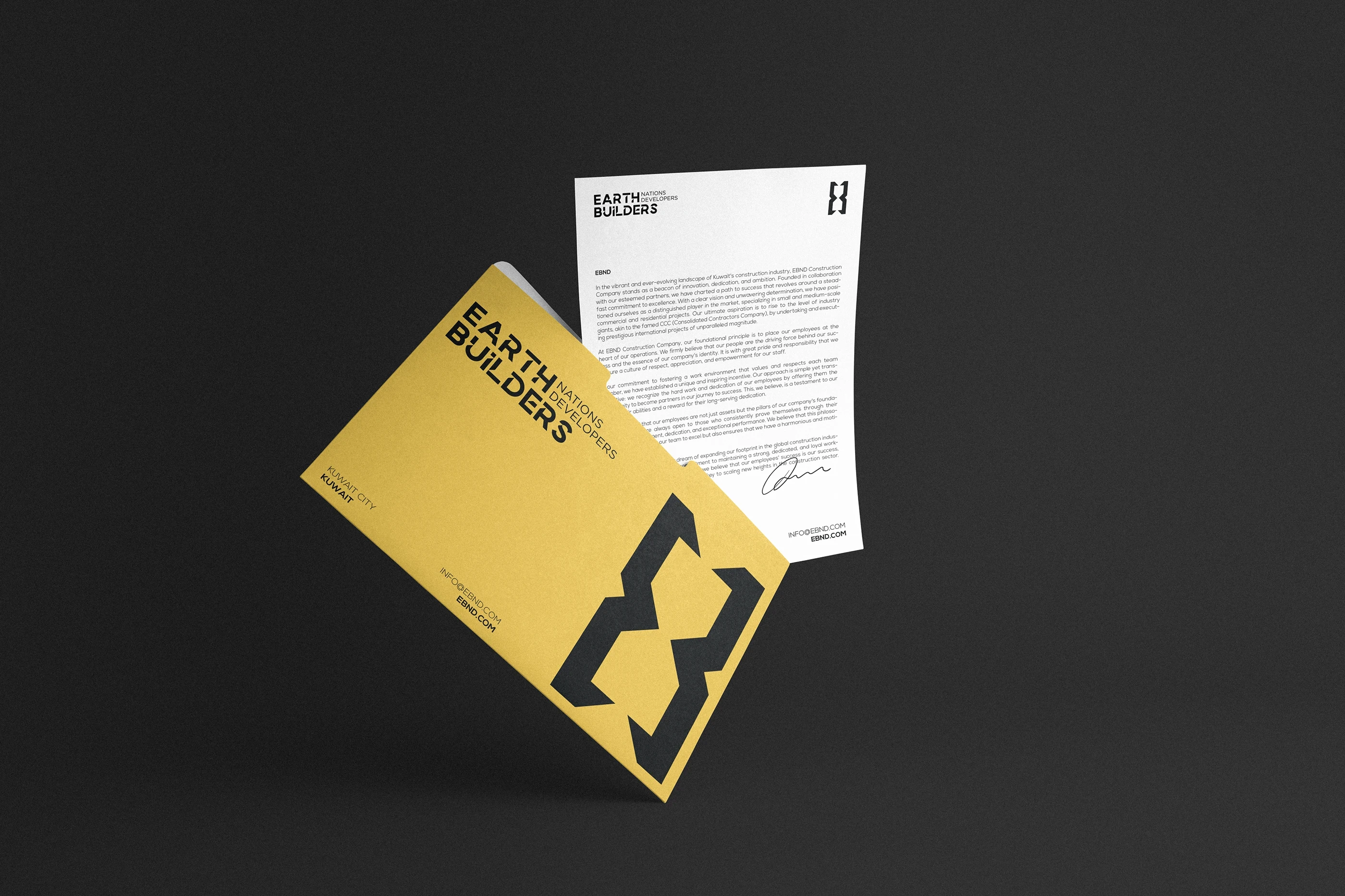
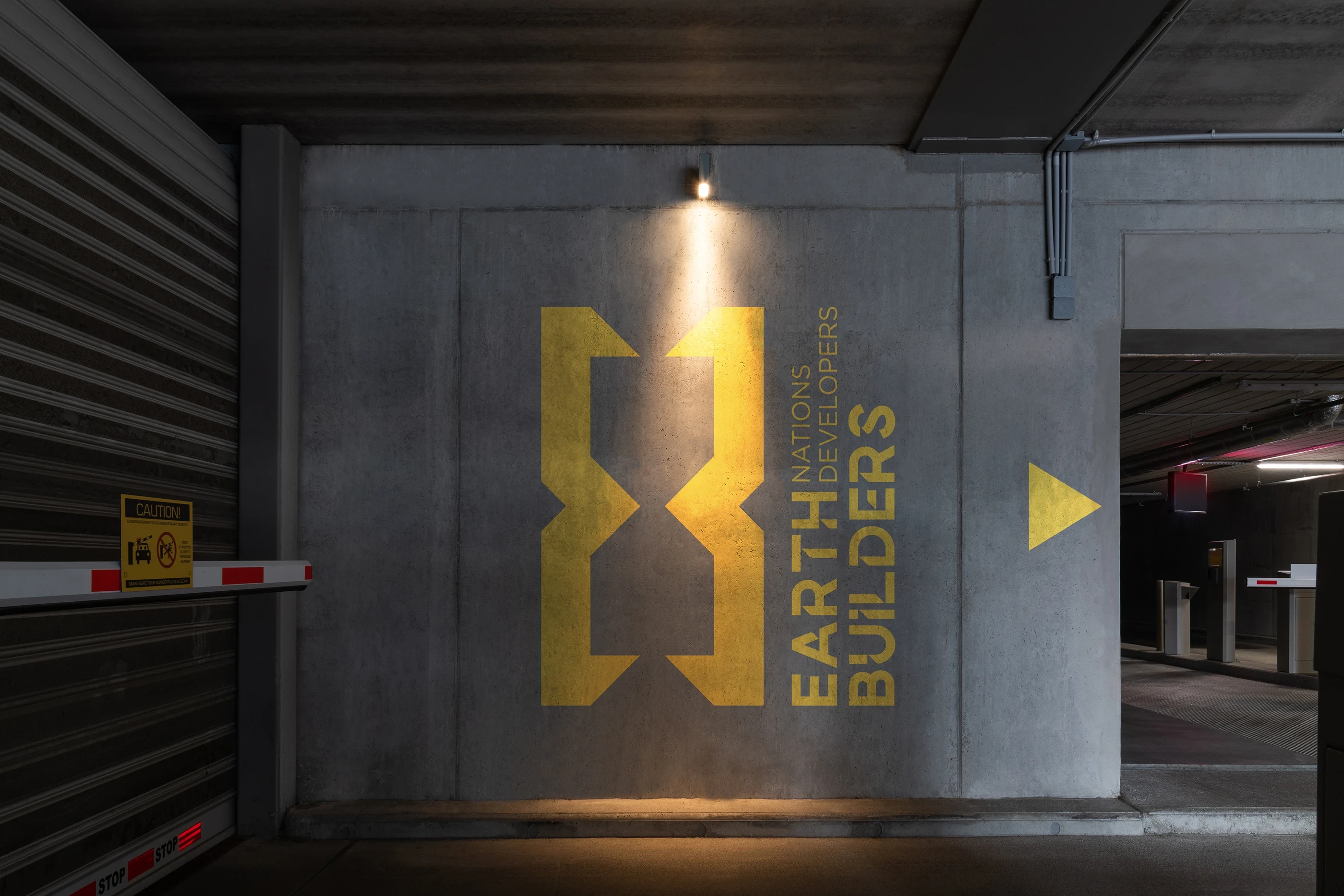
Incorporating the concept of time into a logo for a construction company like EBND, where timely project delivery is a point of excellence, can be a creative challenge. The logotype features the initials "EB" for Earth Builders, designed in a modern, clean, and professional way.
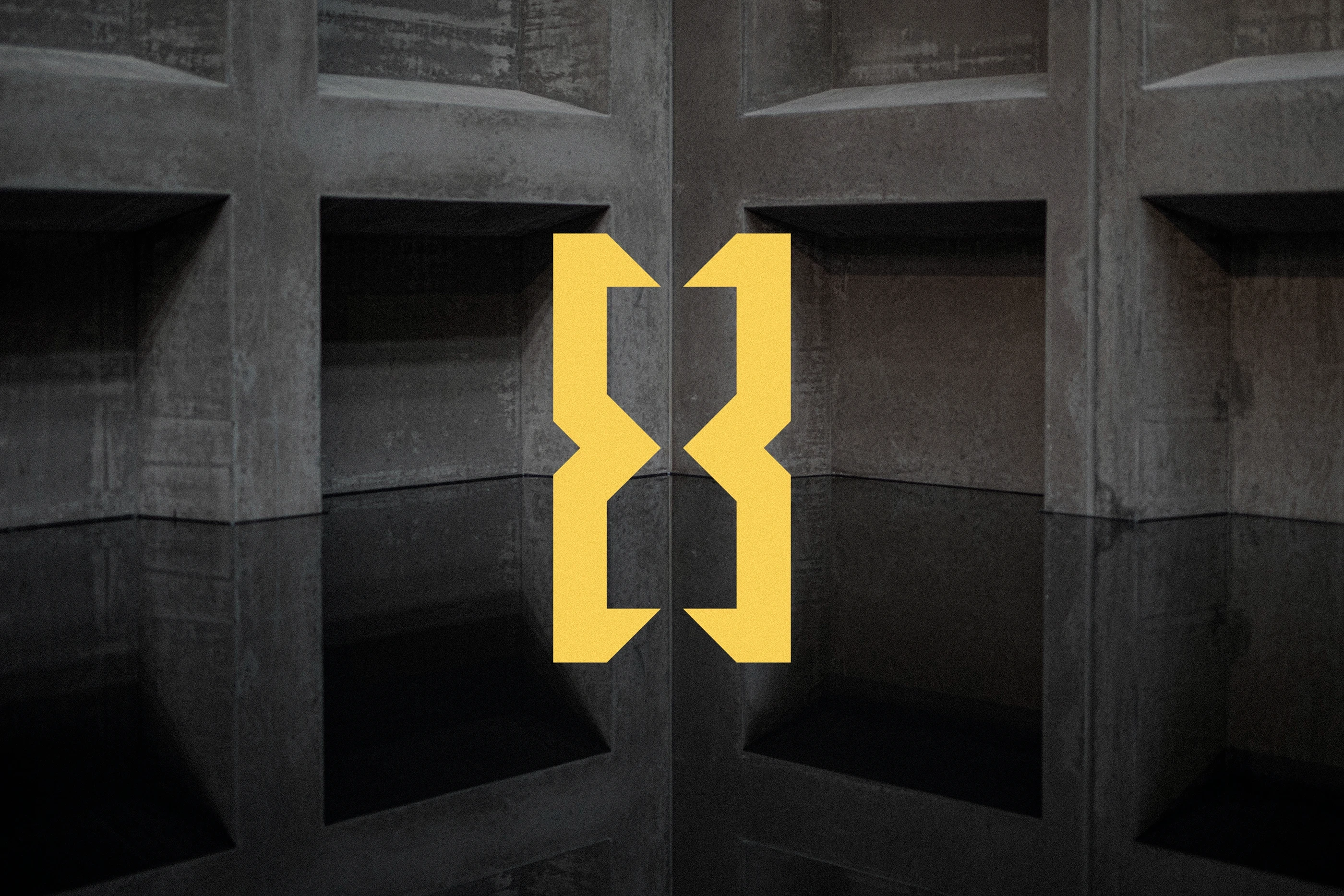
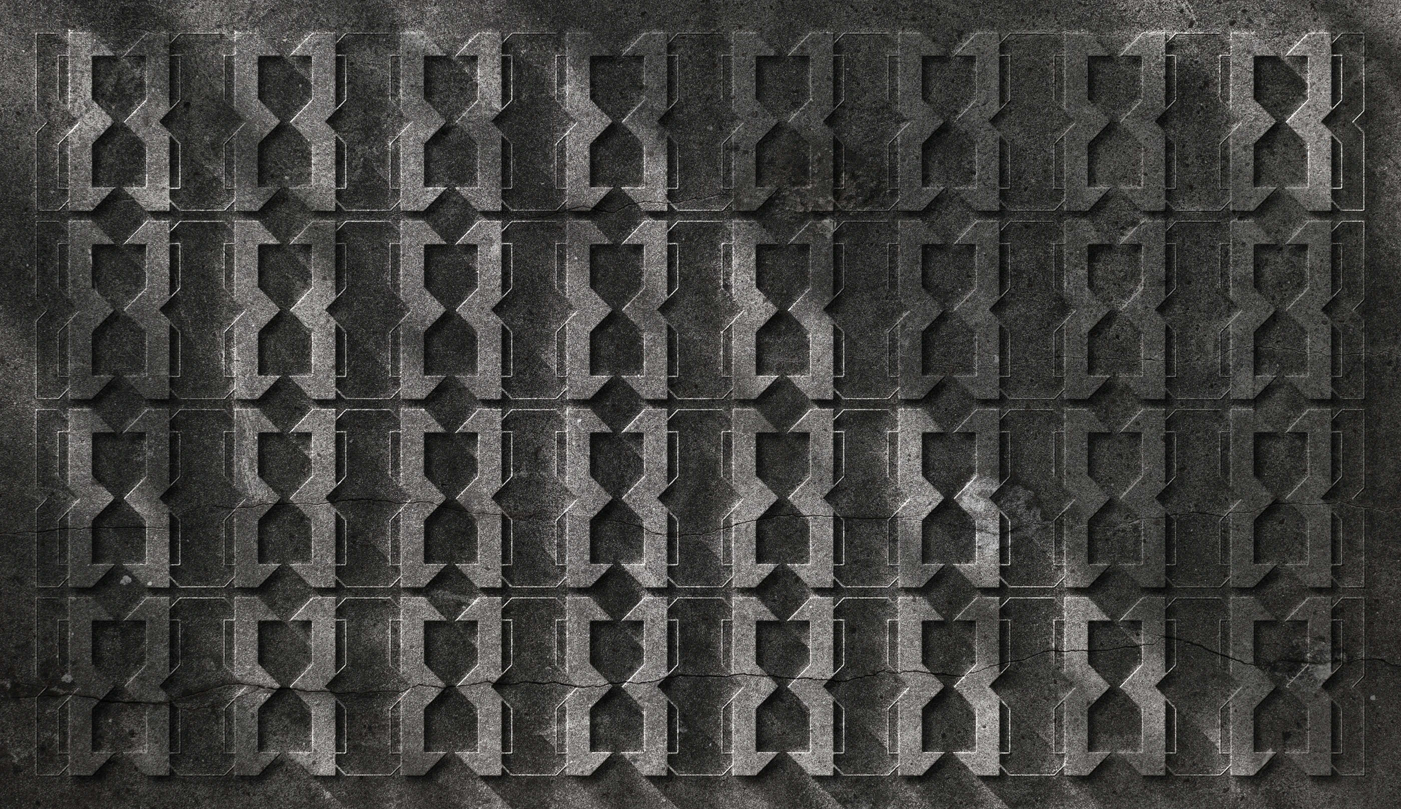
The hourglass is cleverly integrated into the logotype creating a visual connection between time and the brand.


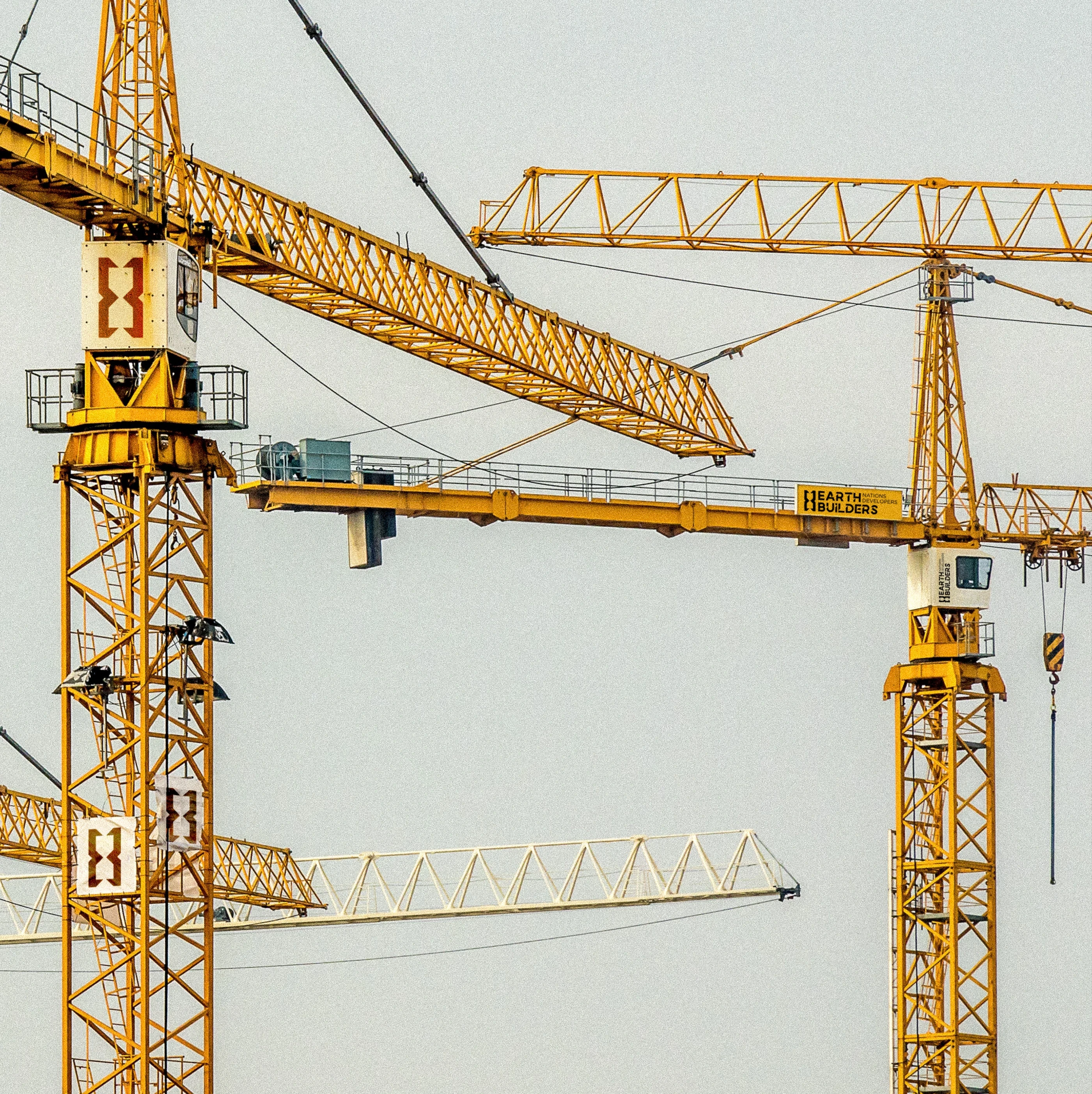

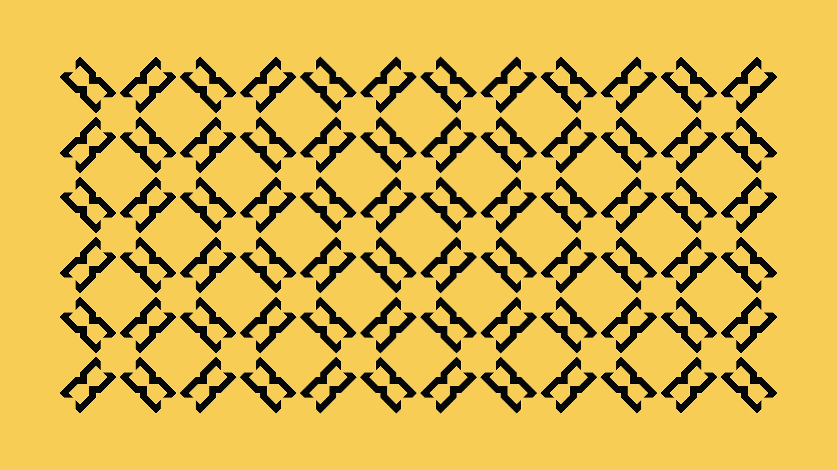
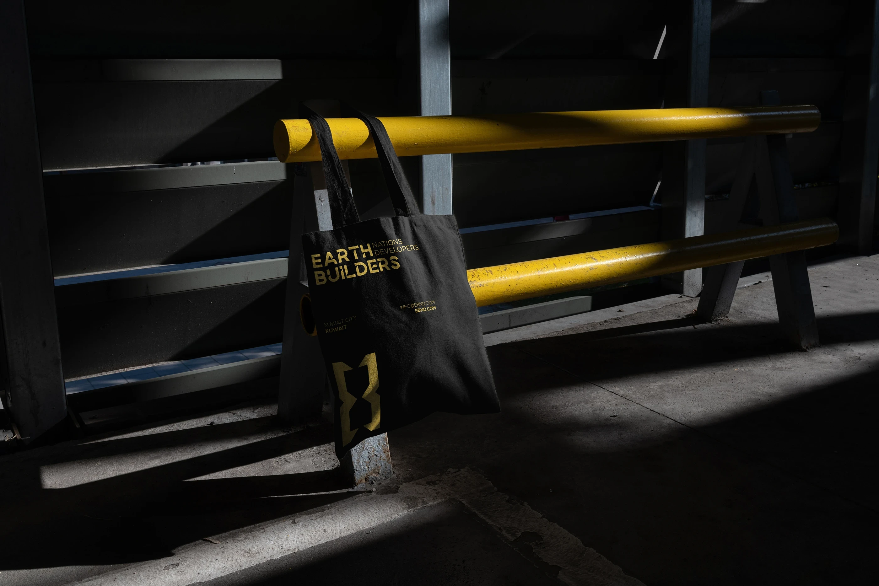
Yellow, used with intention and depth, reflects EBND’s role as a catalyst for growth, progress, and enduring infrastructure. The 45-degree cuts on "Earth Builders" and the icon are used to give a dynamic and unique visual appeal to the logotype. This design element adds a sense of movement and modernity to the logo.
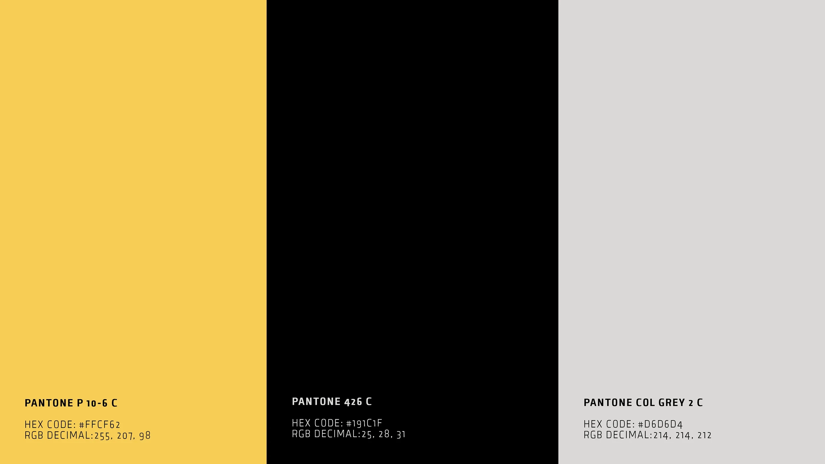
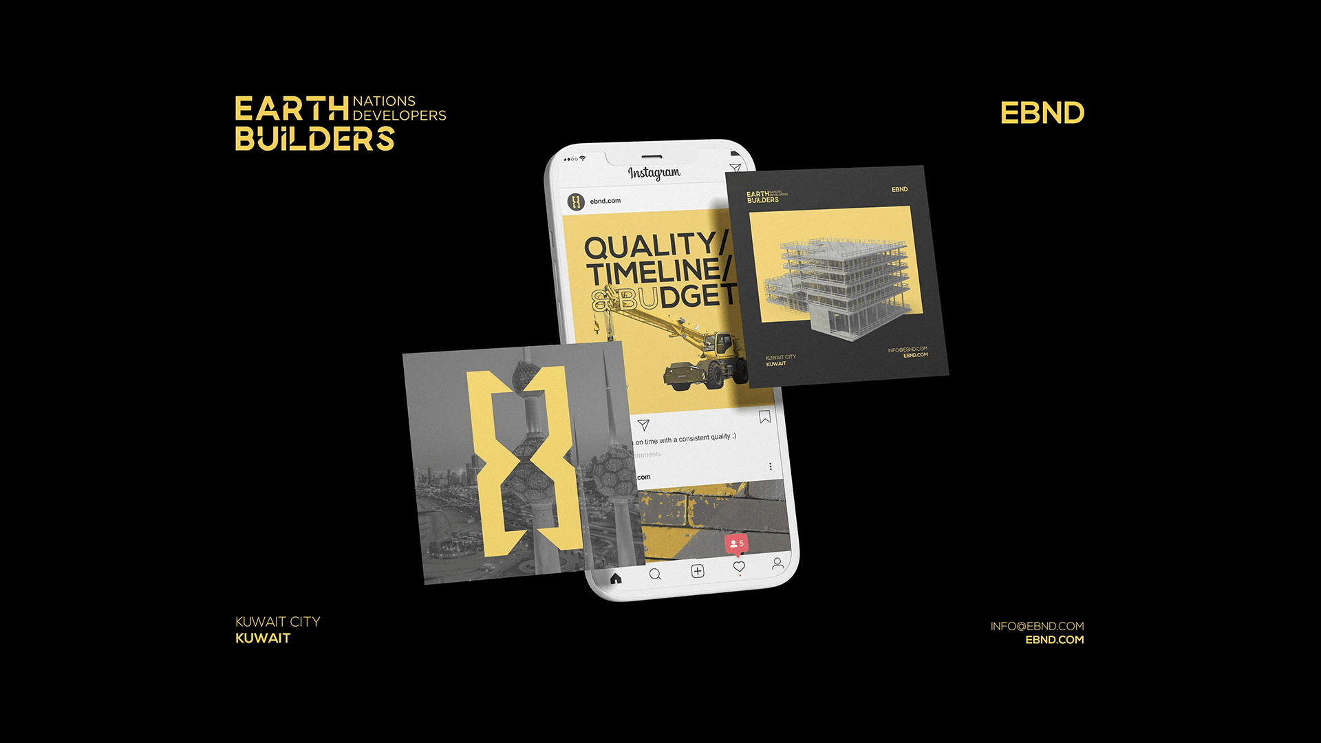
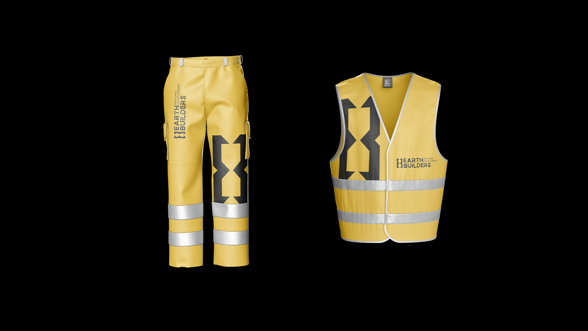
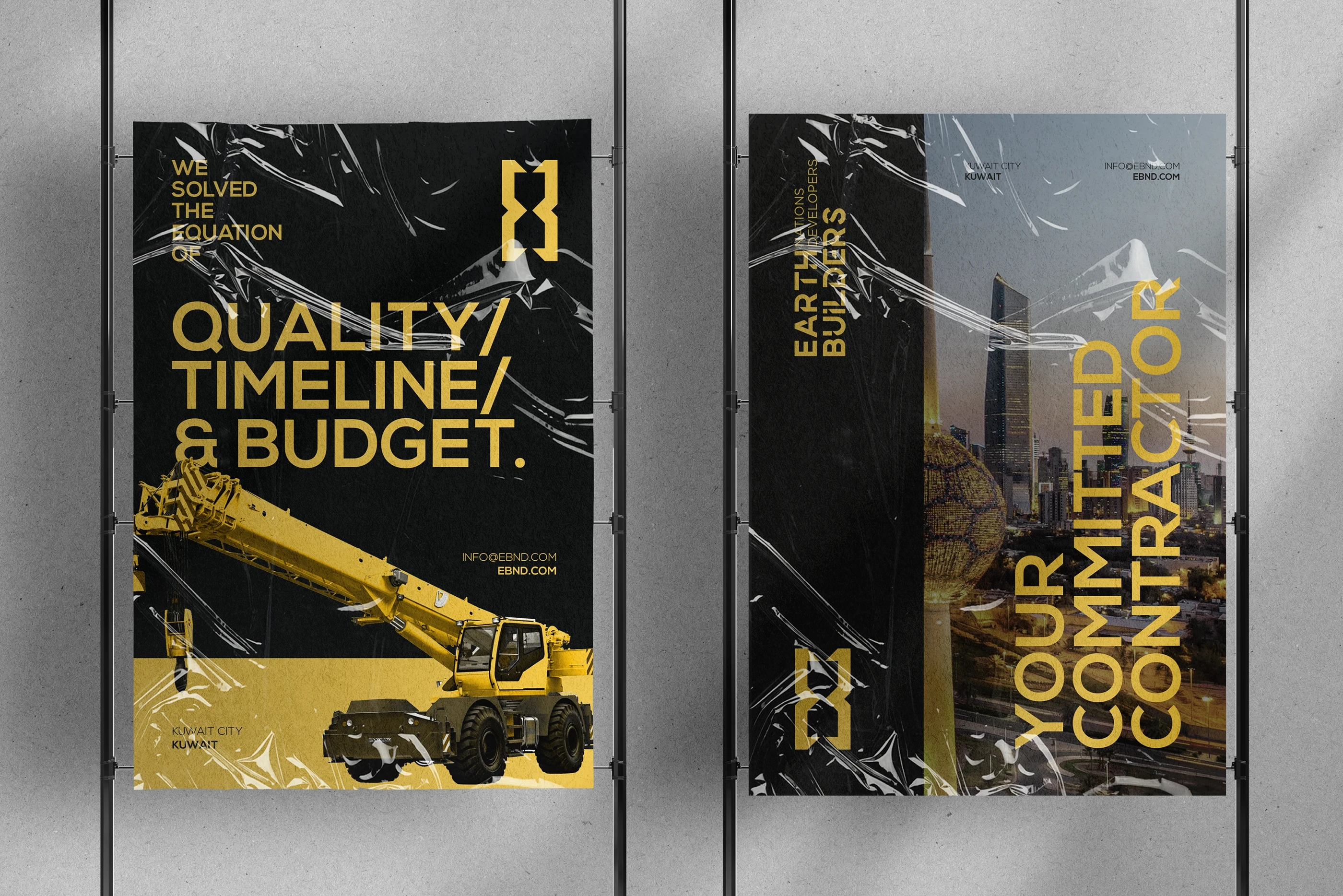
EBND represents strength, precision, and forward momentum in Kuwait’s construction sector. The brand is built on a visual language that is unapologetically bold—anchored by robust yellow shades that symbolize energy.
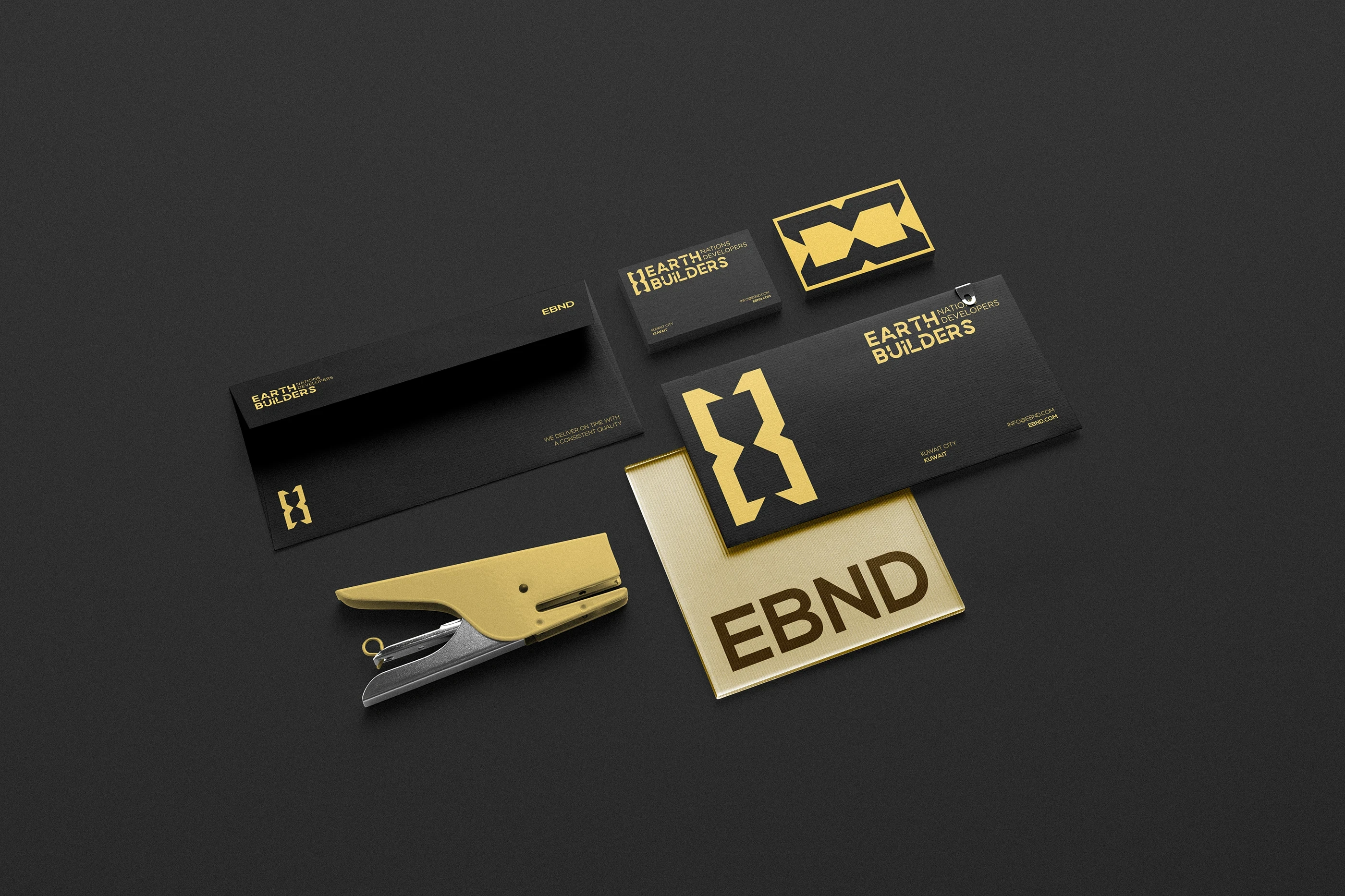


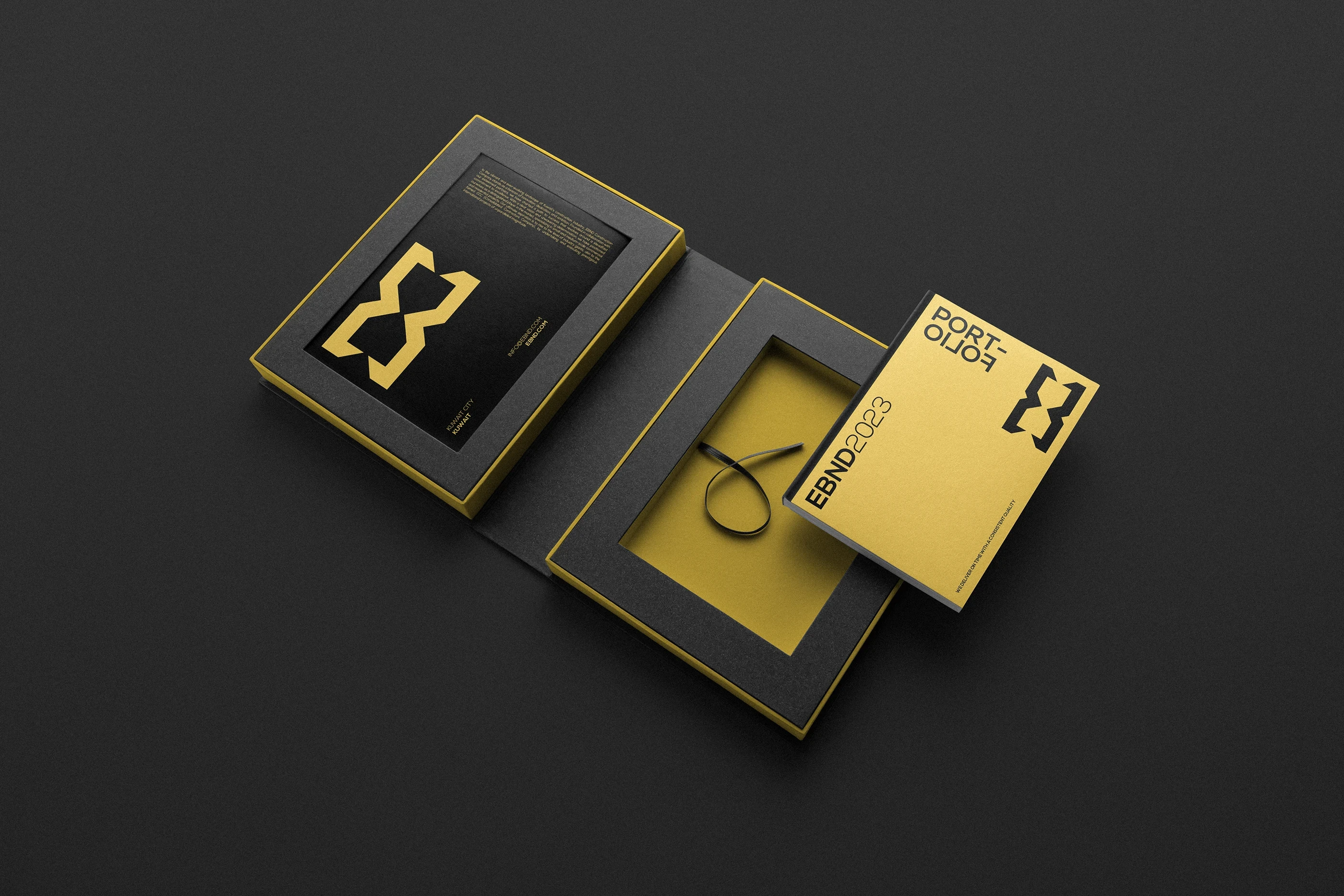

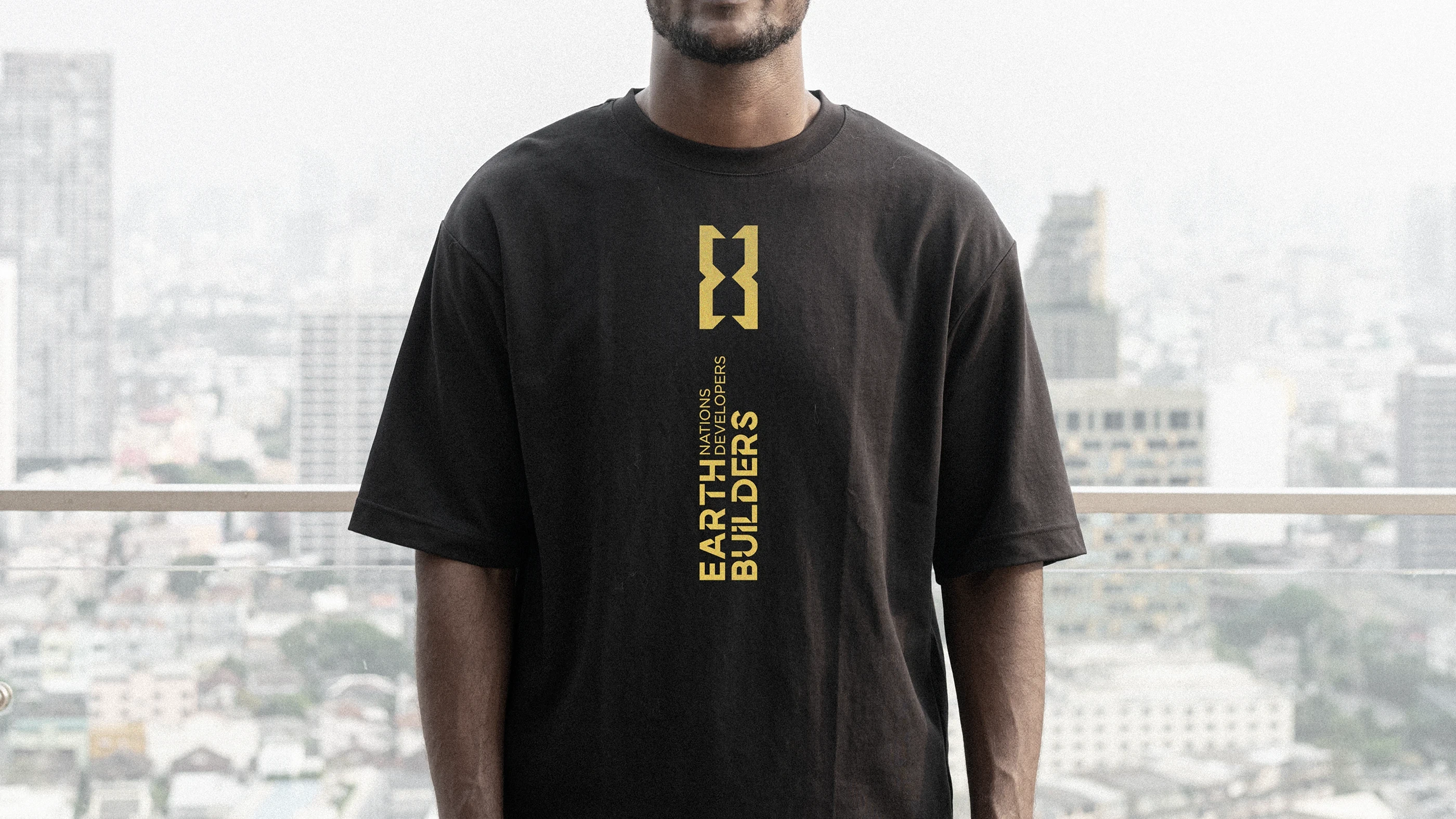
The EBND identity is defined by bold typography and high-contrast compositions, reinforcing a sense of reliability and authority. Heavy, structured letterforms communicate engineering discipline and operational control, while clean layouts ensure clarity across site signage, machinery, safety gear, and corporate communications. Every visual element is designed to project competence, resilience, and trust.
At its core, EBND’s brand identity aligns with Kuwait’s ambition for modern, sustainable development. It conveys a company that is grounded in local understanding yet driven by international construction standards.

EBND approaches construction as a disciplined process where accuracy, planning, and execution converge. Each project is treated as a long-term investment, shaped by careful coordination, technical expertise, and a deep understanding of functional requirements.
The result is architecture that performs reliably while maintaining a refined standard of finish.


Next projects.
2019 — 2026