Clarity before everything.
Mashriq had the substance of a strategy house and the surface of an agency: an orange template, a generic tagline, seven services announced as six, and no Arabic anywhere in the brand. The founder's methods — a single word that defines a company, thirteen business models re-engineered for the region — were the product. Nothing about the brand said so.



The idea was already in the name. مشرق is the East, where the sun rises, and مُشرِق, radiant. Orientation and clarity in one word. We resolved to make the mark say both without drawing a sun: a point, a horizon and three rays, built from one stroke and one origin, converging into an arrow that points East.
Everything rises from one point. Nothing radiates without it.


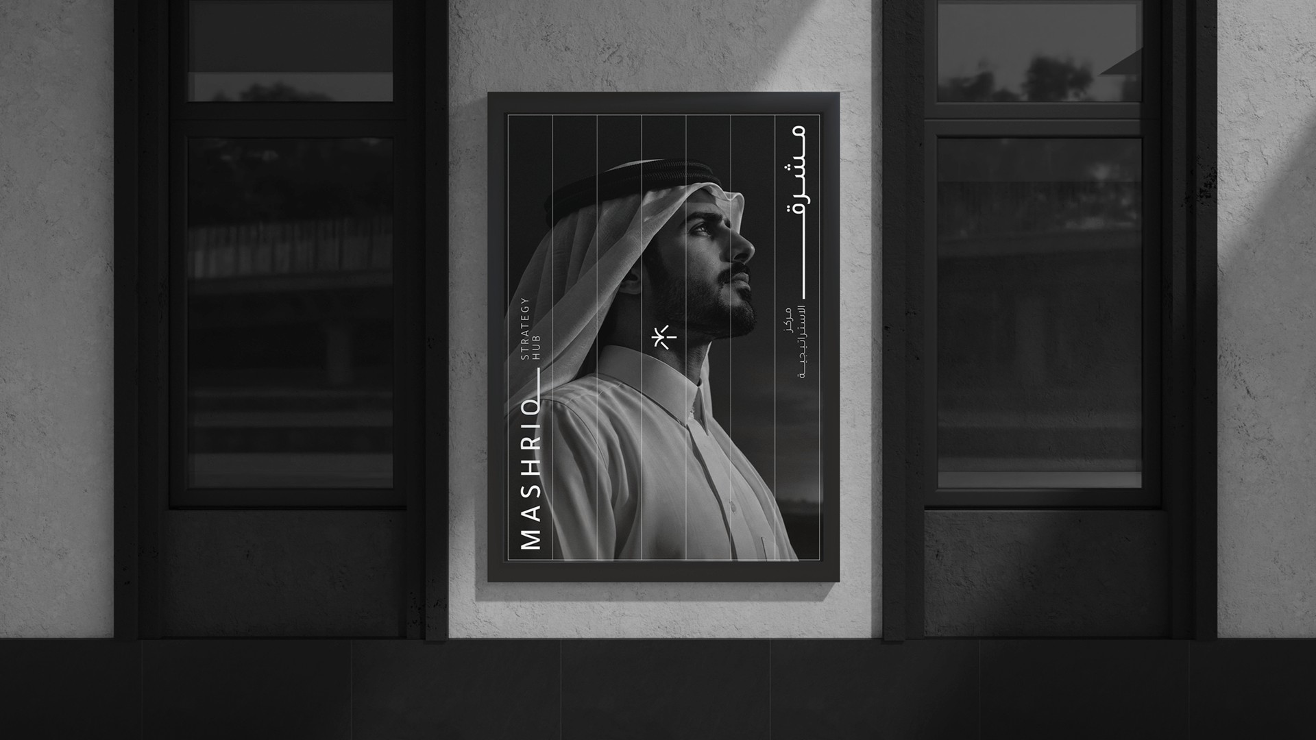
Arabic leads. The wordmark sets مشرق in Tajawal with the qaf's tail drawn out into a long horizon, and MASHRIQ answers it with a Q whose tail runs the same way — two scripts sharing one line. Black, white and grey only. The restraint is the point: a firm you would trust with your business model, not your Instagram.
Always Right.




Orientation, then light.
The line is the system. It carries the wordmark, structures the stationery and separates every page into what comes before the decision and what follows it. One rule, one origin, one word — the same discipline the firm sells its clients, applied to itself.


Next projects.
2019 — 2026