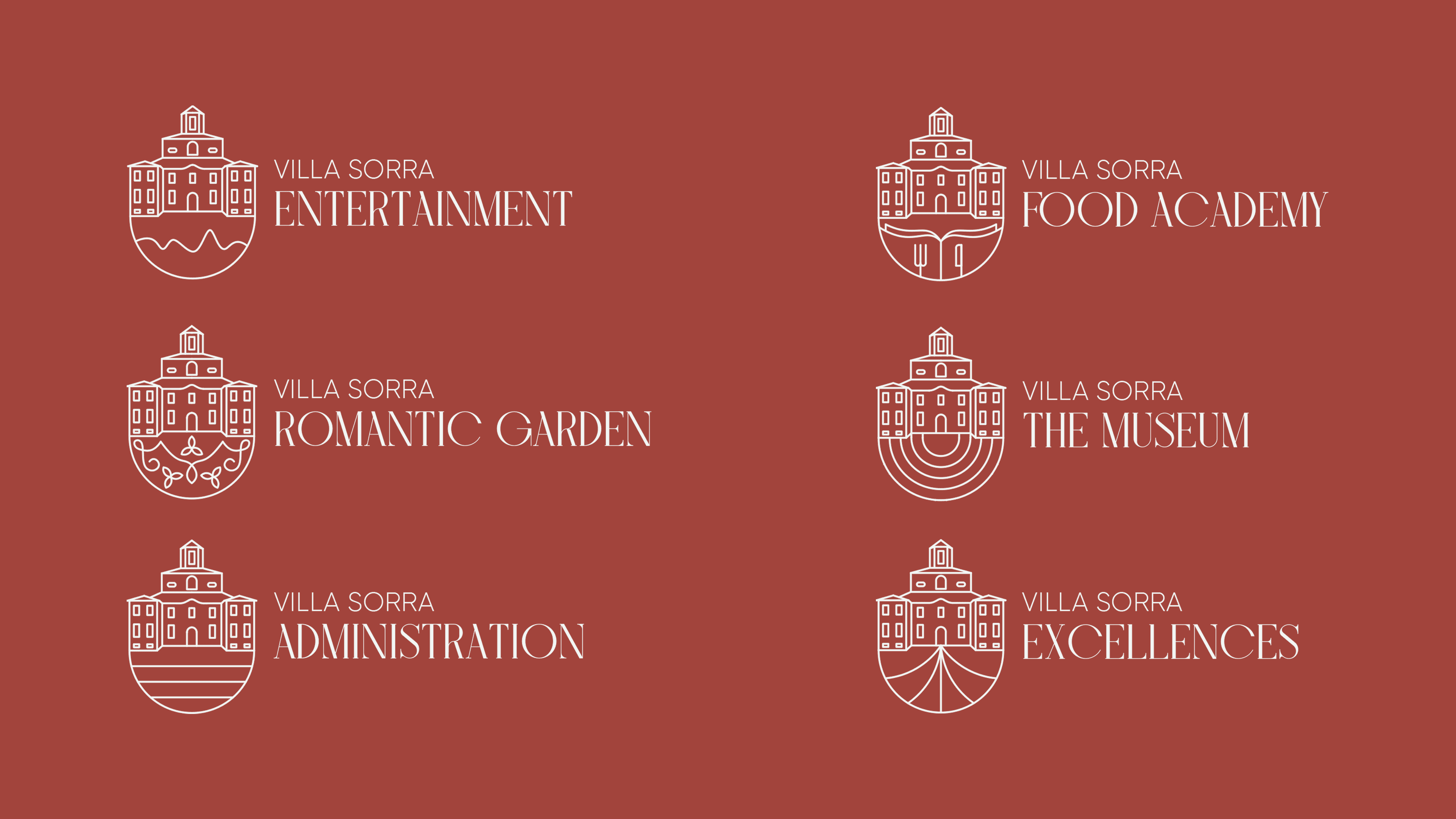
The logo distills the architectural essence of the villa into a refined, geometric mark. Rather than literal illustration, the design abstracts key structural elements—arched windows, pediment symmetry, and balanced proportions—into a minimal emblem.
This reduction creates a mark that is institutional and contemporary while maintaining historical resonance.


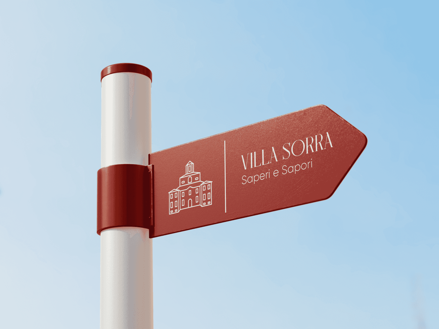
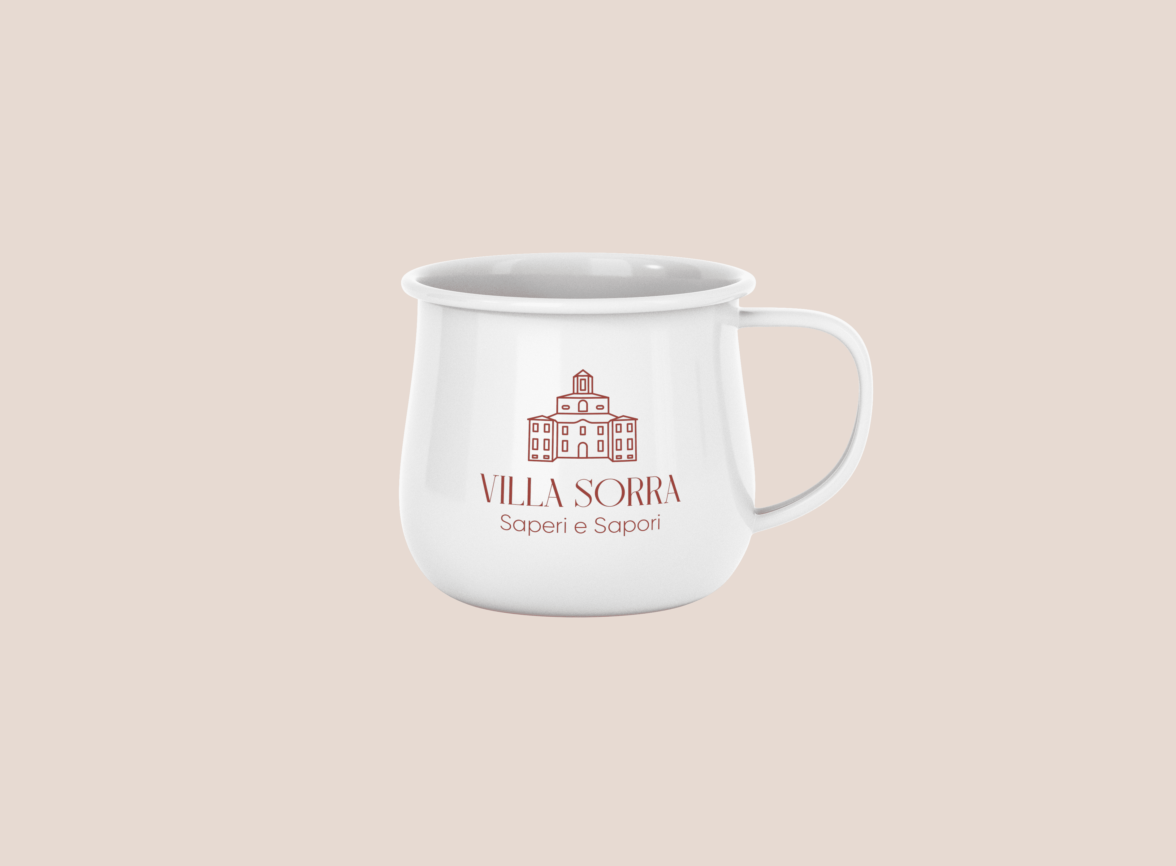
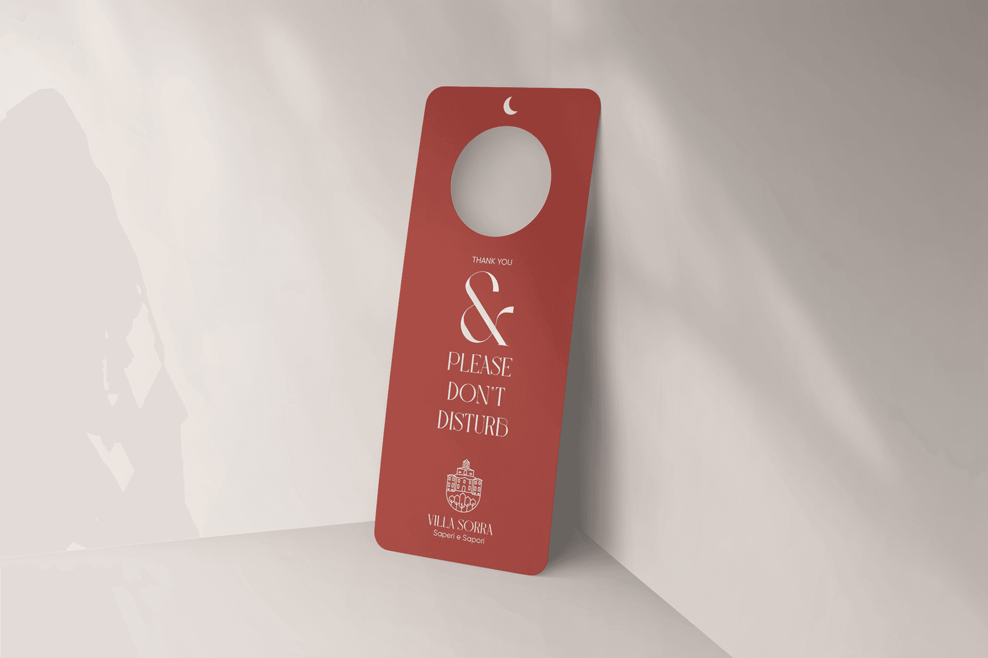
The identity system extends beyond the logo into a cohesive visual language adaptable across print, signage, merchandise, digital platforms, and environmental graphics.
The restrained aesthetic supports flexibility: the mark operates effectively in monochrome, embossed finishes, and scaled-down applications without loss of recognition.


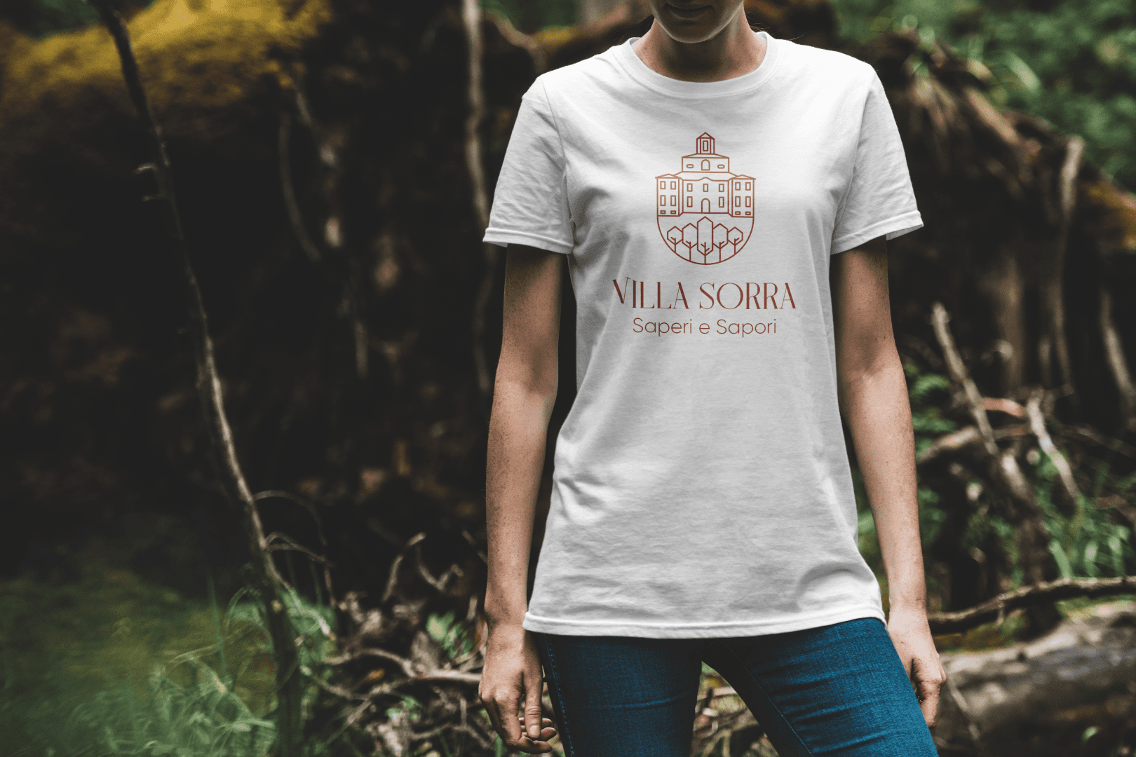
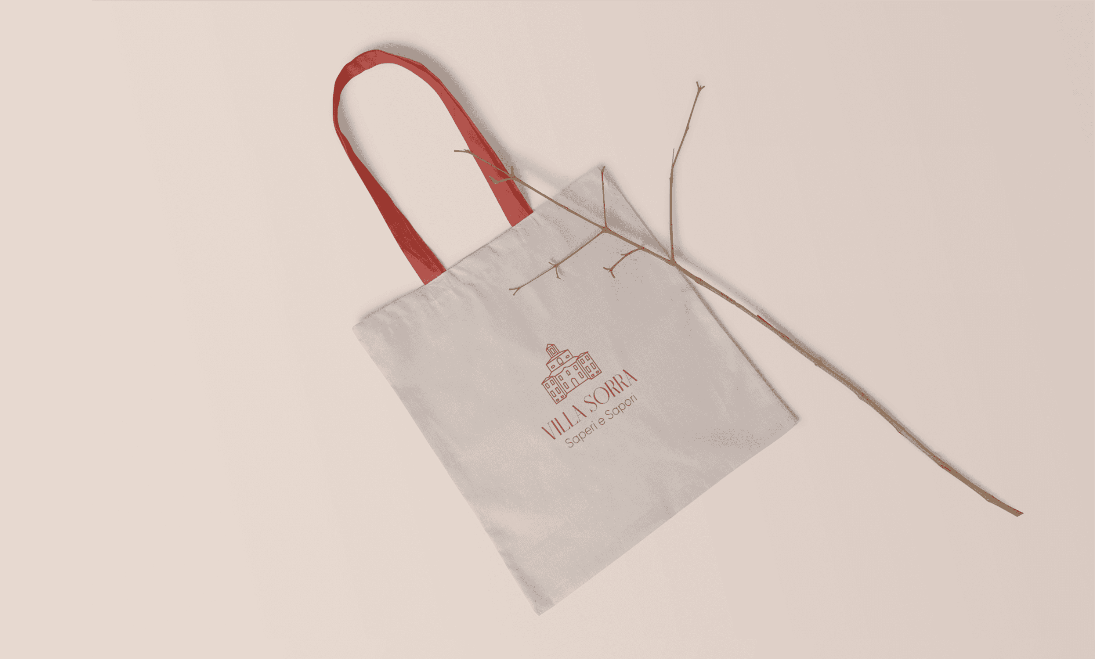
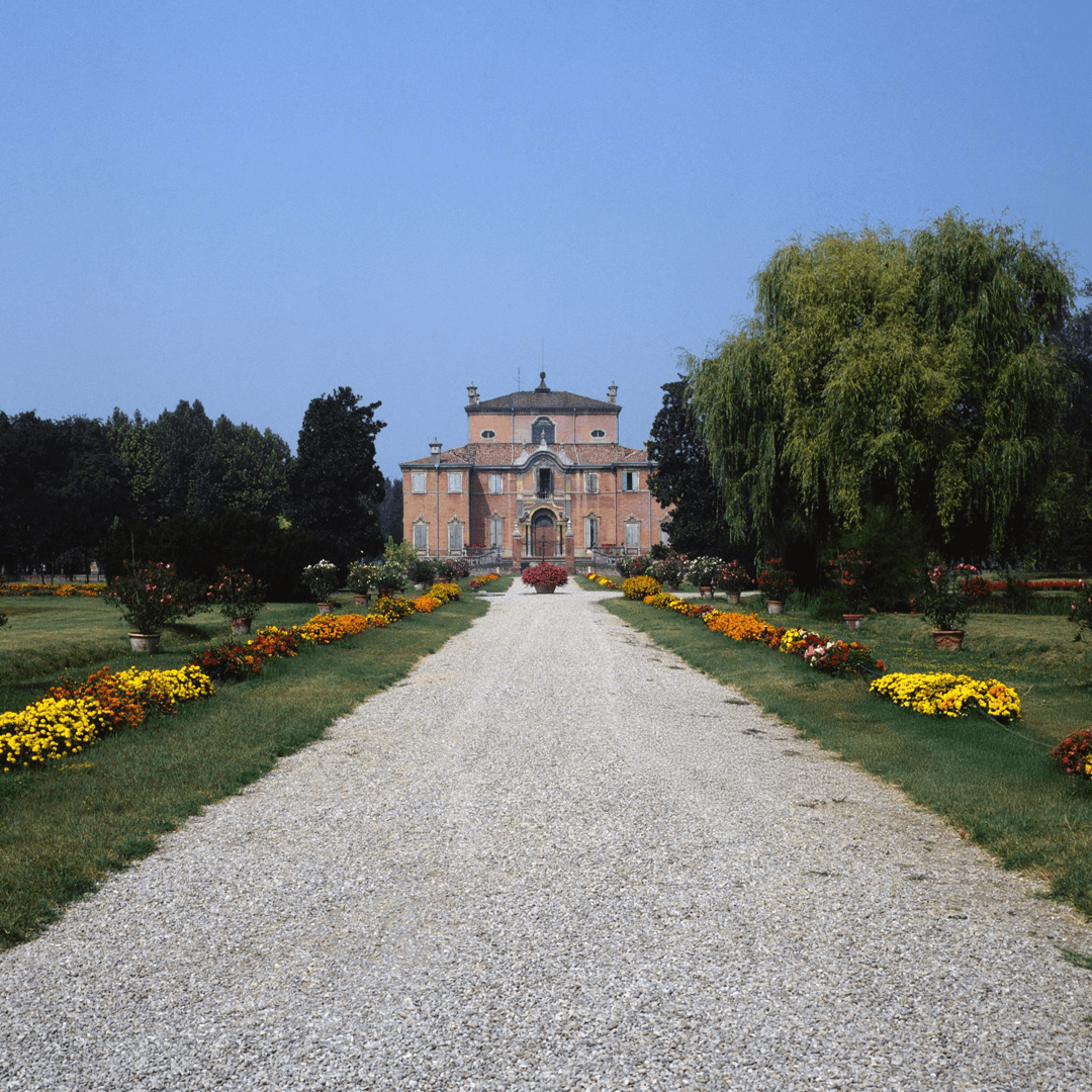
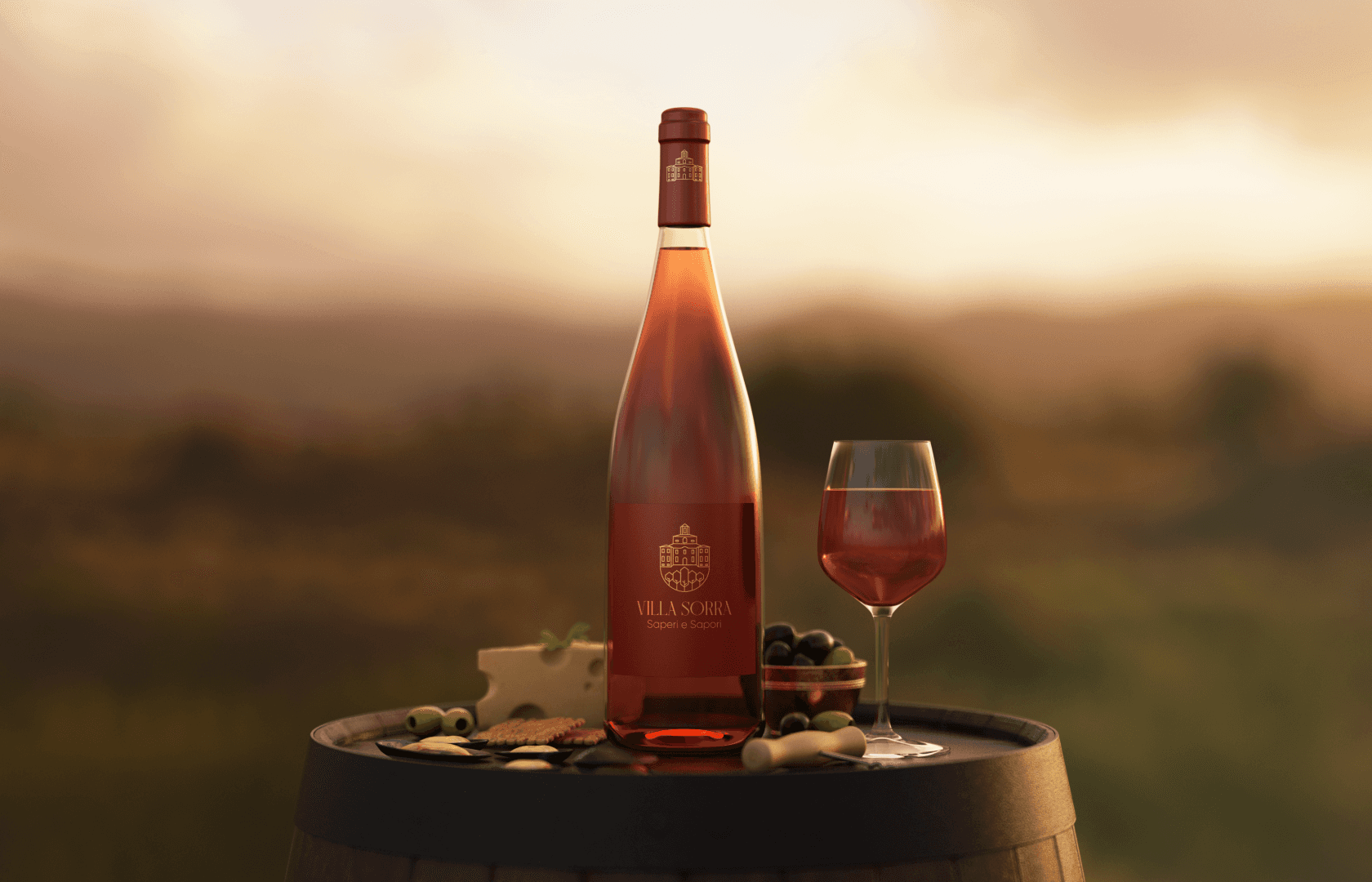
The color system appears to draw directly from the villa’s architectural and environmental context. Warm terracotta tones reference traditional Italian facades.
The use of a clean sans serif typeface introduces contemporary contrast to the historical architecture. This typographic choice balances heritage with modern clarity, preventing the identity from feeling ornamental or nostalgic.


The featured branding project—created by Amr Ibrahim Mousa—earned 3rd Prize in an international competition, highlighting its strong conceptual and visual merit.
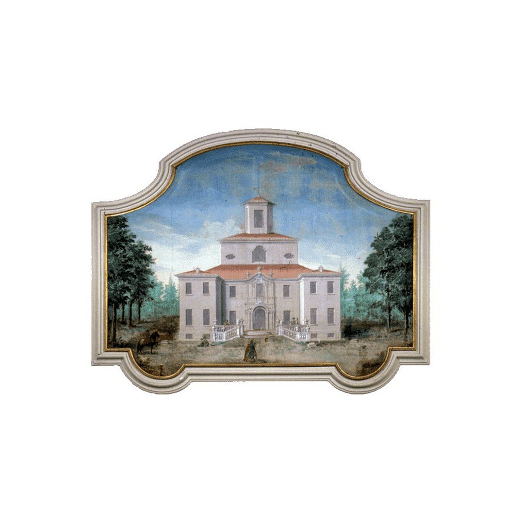
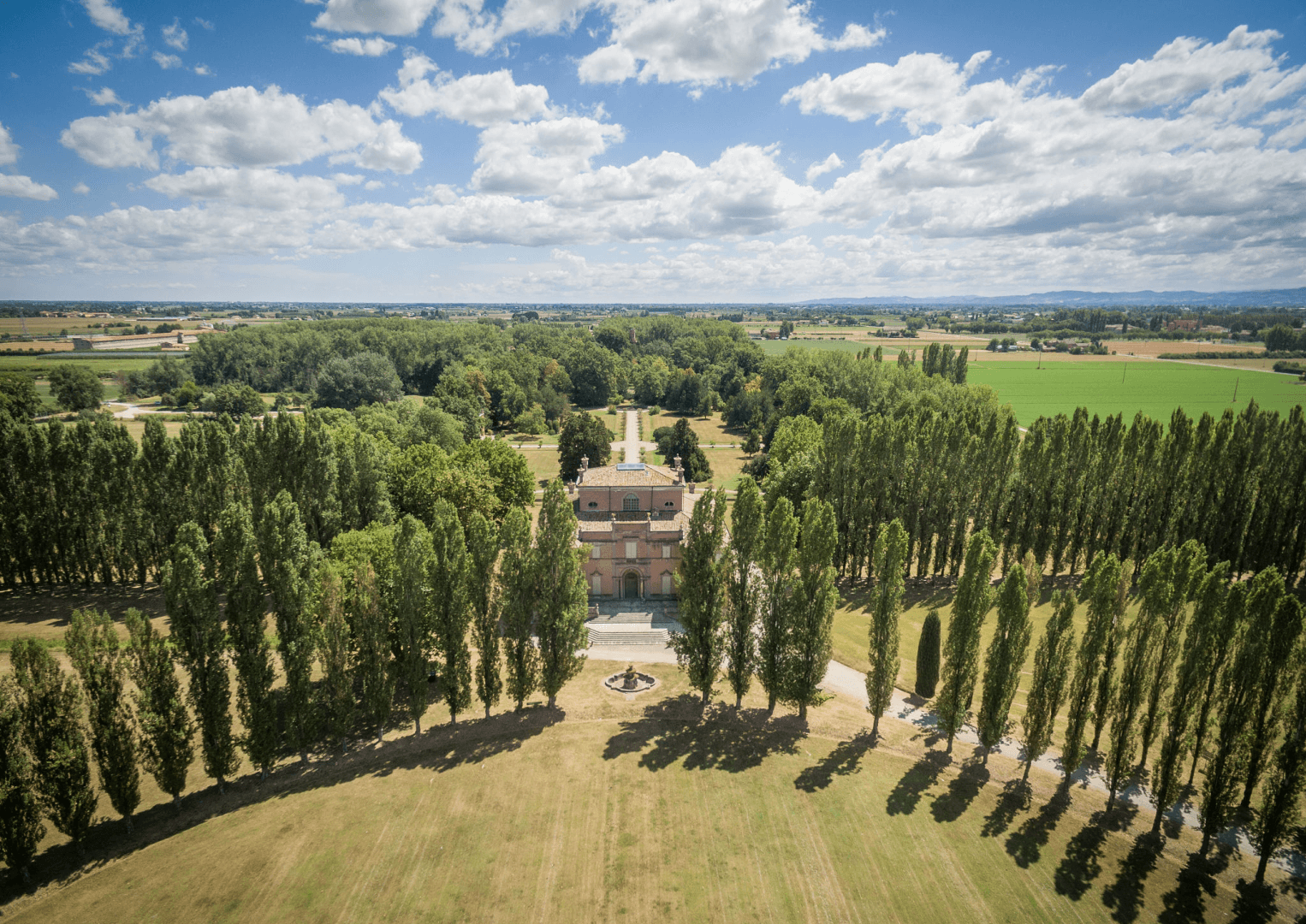
Villa Sorra | CODE - COmpetitions for DEsigners


Next projects.
2019 — 2026